Behind the Sequel Wars Title Screen
I figured I'd share a short anecdote to give you an idea of the things you have to face when making a game for such an old system, and how even things that seem trivial can end up causing unexpected problems. Behold, the process of making the game's attract screen.

AKA this scene which shows you how well you could play if you git gud.
Plenty of games on the system have an attract screen, for example the Sonic games if you leave the controller inactive for a while. The functionality is easy enough to implement - simply store the controller inputs beforehand, and feed those into whatever functions handle input instead of checking for the ones coming from the actual controller. (Funnily enough, resulted in a pretty wacky bug in the 1.0 release if you changed your controller setting. Whoops...)

Another example of an attract mode where the game plays itself.
If you compare the scene from Sonic and Sequel Wars though, you might figure out where the problem comes from. The former just displays regular gameplay, exactly as it is when you actually play the game. Sequel Wars on the other hand, covers about half the screen with its giant game logo, as the sequence also doubles as the game's title card.
"That's it?", you may ask. Yes, this single act of displaying the logo is responsible for the rest of the article. How hard can it be? Well, there are no less than three separate limitations looming over us:
-COLOUR LIMIT - How many colours can be displayed on-screen at once, and which sprite can choose which colours.
-VRAM LIMIT - How many tiles of graphics can be stored in the system's memory.
-SPRITE LIMIT - How many sprites can be properly displayed on a single line.
THE COLOUR LIMIT
A Mega Drive devlog that starts by talking about colour limits, who would've thought? :P
So, the two relevant limits here are as follows:
1) You can only store 4 lines of 16 colours, with the first colour of each line being transparent, for a total of 60* colours on-screen. *1 of these can be set as the "background colour" thus increasing it to 61
2) Each individual tile can only use one line out of four.
Surprisingly, during pretty much all of the development the colour limits were a non-factor. I arranged the palettes in such a way that each element has exactly the colours it needs, and can get pretty comfortable with the amount of shades it has.
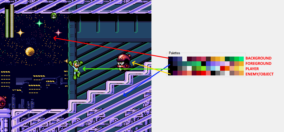
Demonstration of the game's palette distribution.
Now if you take a look at the image above, you might notice the issue: basically the entire palette is already completely used up in regular stage gameplay. There's pretty much no space for even a single extra colour gradient! This is not normally an issue, but when you suddenly need to put a giant game logo over the action... It's a bit of a problem.
There's no other choice but to go for desparate measures. It's time to go colour scavenging.
Let's take a look at the logo itself. It has two parts - the "MEGAMAN" part in a blue hue, and a yellow/goldish "SEQUEL WARS" part.
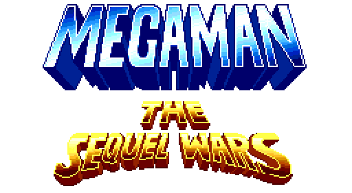
Credit to BlonemonX for this initial logo!
Looking at the palette again, there is actually a very nice source of blue - Mega Man himself!

Mega Man's sprite and the colour palette it uses.
Despite technically having two different shades of colour on his outfit, in his base form they're close enough to form a 6-colour blue gradient. The logo's blue gradient will have to be crushed a bit, but the result still looks alright.

Left: draft, Right: final version
Now of course, there are caveats here. Mega Man is not always blue - he changes colours when switching weapons, and more importantly when using this trilogy's iconic buster charge function. There is no way around this other than to just never use those features. This is why Mega Man only uses the uncharged buster in these scenes. As a plus, since Mega Man is in every level, the blue will always be loaded in, meaning there's no need to worry about having to pick a specific stage. Sadly the same can't be said for the next part.
The bottom of the logo is a much bigger problem. There is some yellow in the player palette, but it moves towards a bright red and there's not nearly enough of it to look acceptable. The other palettes will have to be scavenged.
This becomes much harder as they vary massively from stage to stage, and even just between different stage segments. The enemies on-screen at any point pretty much use the entire enemy palette and they're usually nowhere near the colour we need, so that's out of the question. The logo also has to be pretty bright and striking, while the backgrounds are always dark and low-contrast to not distract the player, so the foreground palette seems to be the choice here.

The foreground palettes of these levels could be a good fit for the logo.
Three stages end up having a colour scheme that can fit - Toad, Bright and Pharaoh. The Brightman stage has a core gimmick of turning the stage black, which is done by fading the stage's palettes to black, so that one's out. That leaves Toad and Pharaoh, which actually are the stages used in the final for these scenes. That doesn't mean the problems are dealt with at all though.
The minimum amount of shades the logo looks OK with is 7. The darkest one needs to be used for the shadow, and using a pure black here clashes with the rest of the logo.

The foreground palette used in the first segment of Pharaoh Man's stage.
Let's look at Pharaoh Man's stage first. The FG palette has two gradients of 6, with one actually being 5 since one colour is used to store pure black. Even utilizing a full 6 shade gradient is not enough. This is where a dirty solution comes in.
The last three colours of the palette are used for the twinkling stars in the sky by constantly cycling between various colour values. 1/3 of the stars are filled with the first colour, 1/3 with the second, you get the idea.
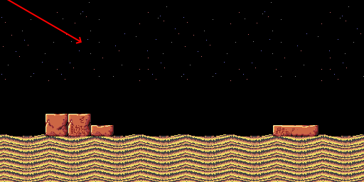
These stars on the foreground layer are scrolled at a different rate to give depth to the background. They also constantly shift colours.
Well, these stars are just little dots in the background and will be mostly behind the giant game logo. Who's gonna notice if they get messed with a bit?
Indeed, this is where the final shade comes in. I specifically disable the palette shifting of one of these colours if the attract mode is enabled, and use that colour slot to store the missing 7th shade of the logo. As a byproduct, 1/3rd of the stars will be permanently bright only during the attract mode, but it's an acceptable sacrifice. Did you even notice it before reading this?

Regular gameplay vs. attract screen. Notice the difference in the tiny stars in the background. It's more noticeable in motion.
Now onto Toad Man's stage. The palette layout here doesn't offer the same opportunity, as the last 3 colours are used for the very blue waterfalls instead.

The foreground palette used in Toad Man's stage.
The solution here is a bit more invasive. Notice how the brightest shades of both gradients are actually quite similar? They are different enough to give the subtle touch of grime to the old bricks as opposed to the shinier metal, but the game logo will distract the player from spotting the difference. So the solution is to have all the tiles use the same brightest colour no matter what gradient they use normally, and place our remaining shade in the now free slot.

Regular gameplay vs. attract screen. Notice the difference in the colour of the bricks.
A problem with this solution is that you can't just trivially repaint the tiles to use another colour. It requires changing the data of all the tiles and basically storing a whole separate tileset in the ROM just for this change. Funnily enough, the next limitation actually plays in this problem's favour.
THE VRAM LIMIT
In order for the graphics chip to know what to draw and where, it needs to store all the relevant data in its memory, known as VRAM. Aside from having to store things like which tiles make up which image layer or where each sprite is, it also needs to store the actual pixel patterns that make up the tiles. Being a component made to be cheap 30+ years ago, its memory isn't exactly plentiful. The image below shows the entirety of what's available to store at once.
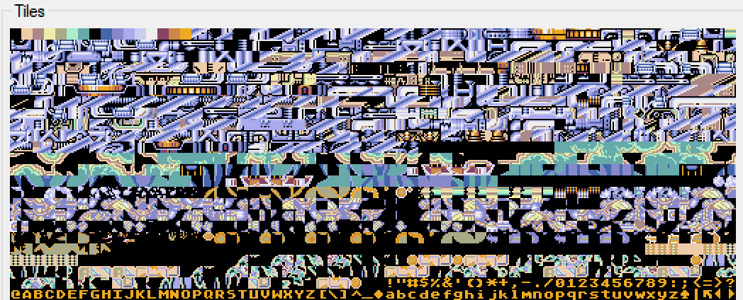
Pictured: everything that can possibly be displayed in a single screen.
Once again, the image above is a demonstration of the VRAM contents when playing through a stage normally. It contains the stage's tileset, the tiles for the currently displayed background, the tiles for the currently loaded enemies and other stuff like the player, their weapon, etc. Which means, you guessed it, no space for a giant logo. I pretty much needed to detonate a nuke in the VRAM to get a crater big enough to fit the thing.
The first thing on the menu was to lower the logo's size. It could easily look silly compared to the Wily Wars original, but something had to be done. In the end, despite the final version being notably smaller, it still looks pretty fine in my opinion.

The original draft vs. what finally got in. The "MEGAMAN" part of the logo got a significant cut.
This reduced version is still too big to fit into VRAM. Other cuts have to be made. Almost everything loaded in is used, but looking hard enough there are some cuts left to be made.
One part of the VRAM holds the tiles for the player's weapons and particles. This includes the cartoony effect that displays when the player gets hurt, and the graphics for the player's bullets, including the charge shot. If you remember, the charge shot already can't be used here because of palette limitations. Therefore, the large graphics for it are also not needed! The hurt effect can also be phased out by simply having the demo take no damage. And they say gaming skills aren't useful...

A significant portion of the weapon graphics is taken up by effects which we don't need here.
There's still more space that needs to be emptied, and the final optimization is with the tileset. These demo segments don't have to show the entire stage, just a part of it. The cool thing about that is that a fair chunk of the tileset won't get used in these brief sgments at all, so they're not actually needed. So for the demo's purposes, only a fraction of the stage's tiles is actually loaded. And because of the previously mentioned palette changes, the stages in the demo actually use their own specifically made reduced tileset. With this, there's finally enough space to fit the logo into memory.

VRAM comparison between attract mode and regular gameplay. Notice how much more tiles are loaded on the right.
Now that we have the colours and the tiles, we're done! Wait...
SPRITE LIMITS
Ok, bit of a false alarm, this one wasn't nearly as bad. But it did provide a final bit of annoyance. If enough sprites are on the same line, they won't all show properly and will be cut off. It doesn't look all that great so final cuts have to be made.
For starters, a lot of backgrounds in this game use sprites to act as background elements for enhanced parallax. Bright Man's stage uses them extensively, so the sprite limit is a reason why that stage can't be used for the attract mode even in segments without the "lights off" gimmick.
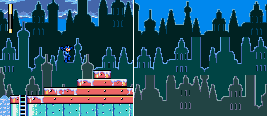
For example, the tops of the background buildings here are actually sprites.
In Pharaoh Man's stage, there are sprites used for additional blinking stars in the background. In attract mode specifically, I had to disable them from spawning to avoid flicker.
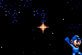
Orange stars like these are sprites too, and are missing from the attract mode.
Finally, in Toad Man's stage, I had to make the demo carefully to not summon too many birds and their offspring at once.
And that's it. It's over! I could finally display an extra image over the game screen...
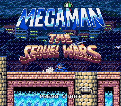
Hallelujah!
I never figured things like these would be much of a problem, but surprises pop up at every corner. At least it resulted in a pretty dope looking title screen.
Hope you enjoyed the read! I might make more if you're interested. If you wan to suggest a topic, feel free to do it in the comments.
Get Mega Man: The Sequel Wars - Episode Red
Mega Man: The Sequel Wars - Episode Red
A 16-bit homebrew remake of Mega Man 4 for the Sega Genesis
| Status | Released |
| Author | Sequel Wars |
| Genre | Platformer |
Comments
Log in with itch.io to leave a comment.
Is there any information about the project continuing to make parts 2 and 3 or has it been cancelled?
I loved this making-of. Very interesting. As for suggested topics...everything! But if I had to pick: how did u manage to switch between different graphic styles (default and purist) thru the menu. This is not very common for Genesis games.
fantastic port
Amazing Port!
Loved reading this 👍
I've been working a lot with GB Studio, usually with a focus on getting as much going on visually as possible, so a lot of this sounds familiar, although it seems like you're a lot more methodical with your workarounds compared to my brute force tactics... 😅